‘Consistent with Advice’
‘Consistent with Advice’ was created at home in London in early 2020 during the national lockdown responding to the COVID-19 pandemic.
Using communication material produced by the UK public sector, I have re-appropriated, re-contextualised, and re-constructed visual elements from these publications.
Governments have continually issued advice about different crises. Some of these crises have not occurred but dominated the public discourse and popular culture. Other crises which have arisen have either not entered popular consciousness or have slipped from it.
These government-issued edicts at times of actual or perceived crisis have largely been similar, regardless of emergency. One can map the advice from the different dangers, and when one compares this it becomes apparent that it is essentially useless; it will not help.
This project maps advice from previous crises onto advice issued for the current pandemic and conveys the consistency of the inadequacy of official instructions.
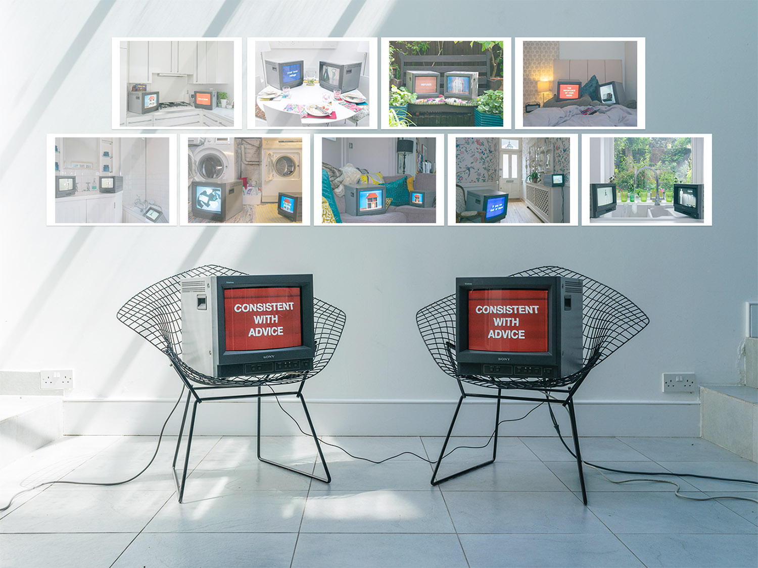
Preview of sculptural installation in gallery space, video, colour, and sound (stereo), 2020
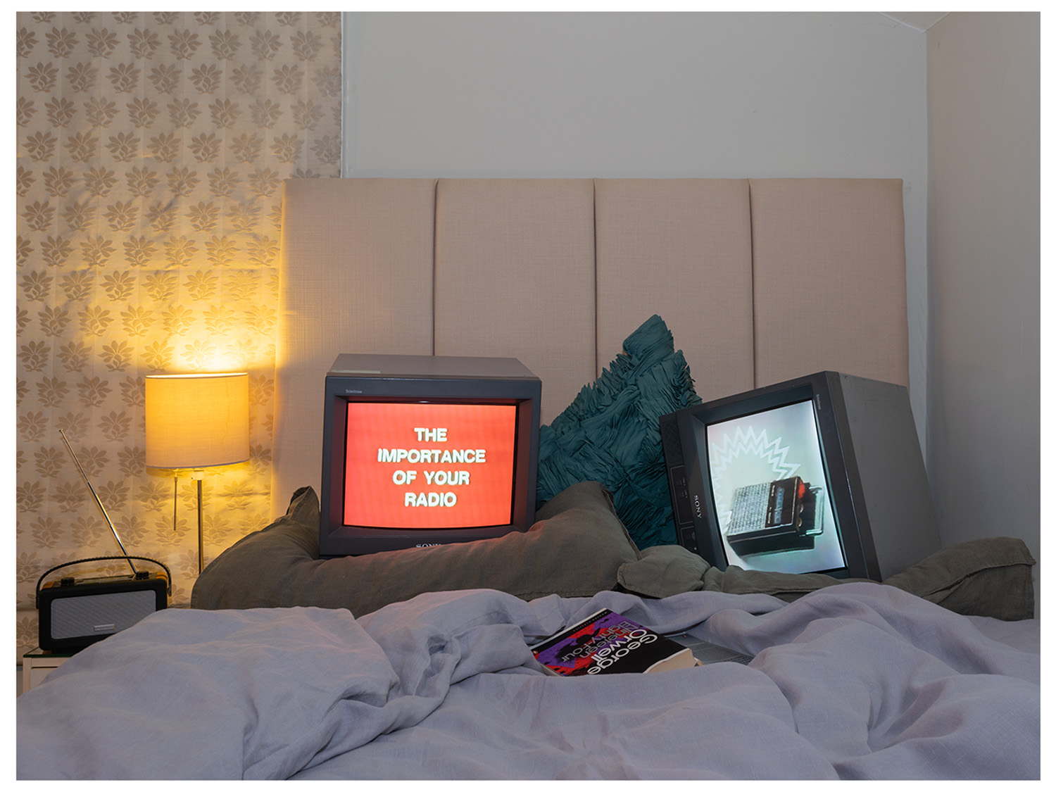
‘Consistent with Advice’ (2020)
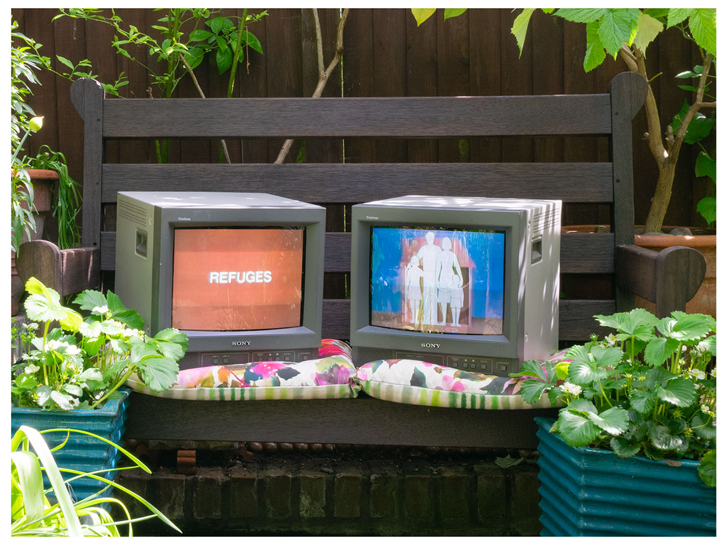
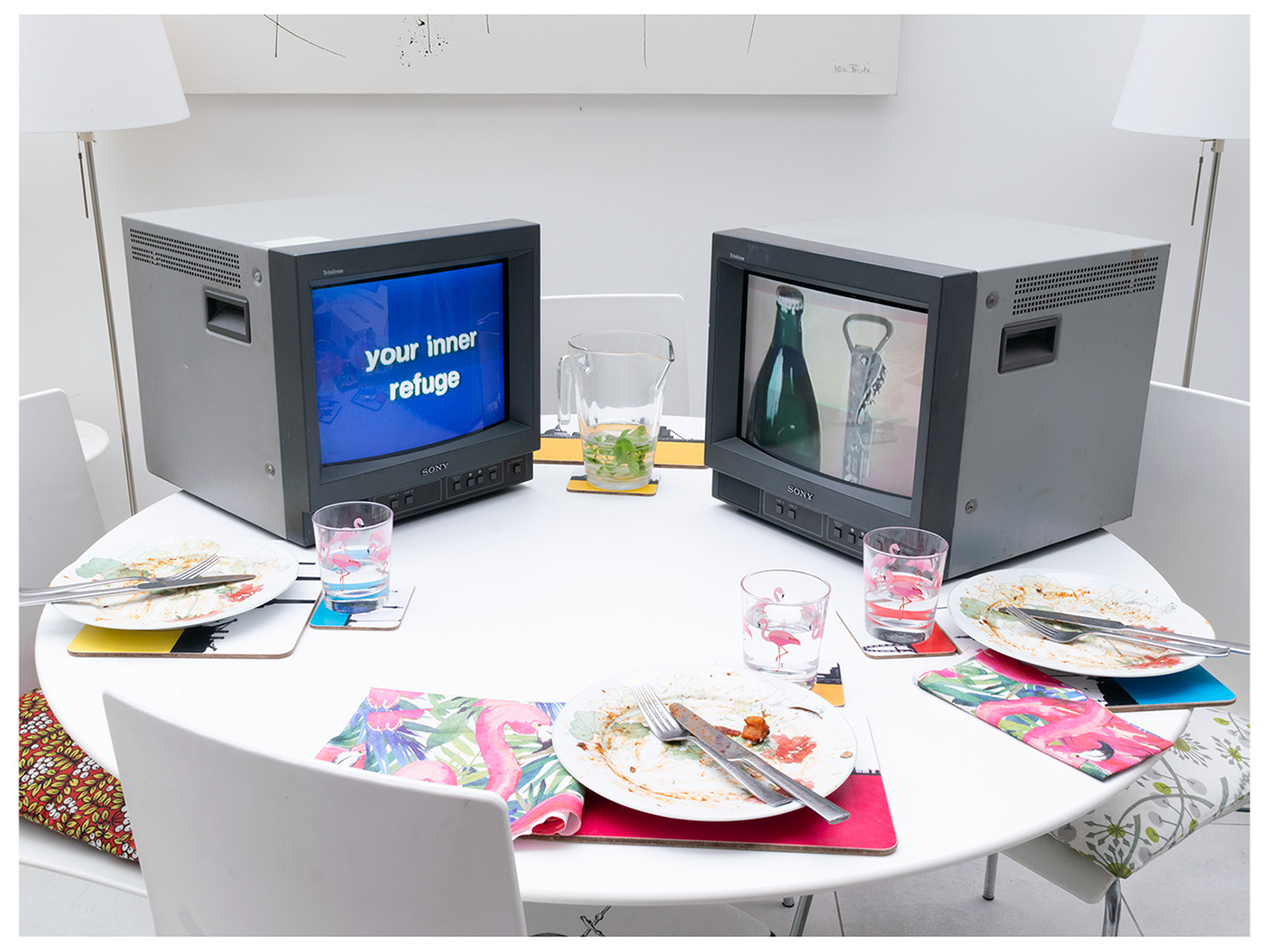
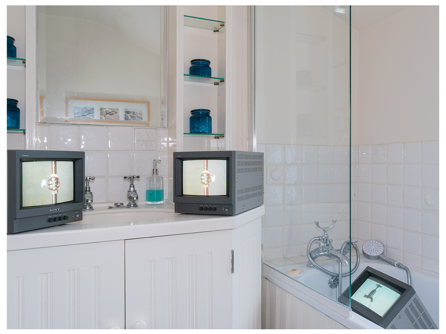
This work, ‘Consistent with Advice’, creates a dialogue between screens, audience, and content focusing on the relationship between preparedness, paranoia, and information distribution. The studio monitors are an industrial medium and receptacles of re-presented communication material within the domestic space.
I have taken the visual language and text from public information films and used these as a source of imagery, specifically, the films of ‘Protect and Survive’, 1976, a public information series on civil defence produced by the British government. The purpose of this was to inform the British public on protective measures to take during a nuclear attack, and consists of a mixture of booklets, radio broadcasts, and public information films.
The information had originally been intended for distribution only in the event of a dire national emergency but provoked such intense public interest that the pamphlets were authorised for general release in May 1980. The films were produced by Richard Taylor Cartoons, the production studio behind the ‘Charley Says’, 1973, safety information films for children.
For the purposes of my work, the Cold War context is disregarded; the focus being on the government advice.
The cultural impact of ‘Protect and Survive’ was pronounced. Some examples of works of art strongly influenced by, and even explicitly referencing it, include the graphic novel and film of the same name ‘When the Wind Blows’ by Raymond Briggs. The title of my piece ‘Consistent with Advice’ is a phrase from the pamphlet issued in early April 2020 by the UK Government , ‘CORONAVIRUS: STAY AT HOME, PROTECT THE NHS, SAVE LIVES’, where the last line of the last paragraph states “this is consistent with advice from the Chief Medical Officer.” This is analogous to Briggs’ adaptation of the phrase “where the wind blows” from the ‘Protect and Survive’ booklet, describing the dangers of nuclear fall-out, for the title of his 1982 graphic novel.
Other works which use ‘Protect and Survive’ as source material include ‘Two Tribes’, an anti-war song by British band ‘Frankie Goes to Hollywood’ which samples the audio from the public information film. A photographic series that shares the name is ‘Protect and Survive’, 1981, by Peter Kennard from ‘Target London’, a folio of 18 posters, bleakly satirising the Margaret Thatcher regime’s nuclear attack directives.
In ‘Consistent with Advice’, I create a tension between the anachronistic studio monitors displaying dictatorial instructions and the everyday domestic settings, conveying the inadequacy of official advice. The work aims to mediate the relationship between the artist, the audience, and the established structures of official information distribution and information consumption, thus exposing and the tension between these.
During the development of this project, I was reminded of Joe Pettet Smith’s project ‘Preparations for the Worst-Case Scenario’, 2016-Present. He explores the “heightened sense of unease that has come to define our times [and] has crept into all aspects of popular culture”. He used appropriated reaction shots of main characters from disaster movies (‘Independence Day’, 1996, ‘Twister’, 1996, ‘The Day After Tomorrow’, 2005 et al.) without showing the resulting reverse shot of the event to convey this unease.
The sense of authority and directive that is found with the monitors has been used in Hollywood productions to present aesthetically coherent, but unrealistic, graphic design shorthand. This use is a way to convey visual storytelling to the audience, which is distinct from actual governmental emergency broadcasts. These are not as visually coherent and do not confer the same kind of authority or urgency as fictional ones.
I am not the first to take information aesthetic, specifically the public information films produced for the UK government’s Central Office of Information, from the mid- to late-20th century and adapt it for satire, critique, or commentary. An example of this aesthetic being used to evoke a specific period is Kris Straub’s ‘LOCAL58TV’, 2016-Present, short films, which was based on mid- to late-20th century American public television broadcasts.
Additionally, ‘Look Around You’, Robert Popper and Peter Serafinowicz, 2002-2005, used the aesthetic of Open University education broadcasts to satirise educational content from the 1970s and 1980s as well as, in my opinion, questioning the legitimacy of the information of such content. This segues into the contemporary notion of “fake news” and “disinformation campaigns” online.
Another ironic use of government broadcast aesthetic was the sketch ‘The Quiz Broadcast’ in ‘That Mitchell and Webb Look’, 2006-2010. This probably took inspiration from the real Wartime Broadcasting Service. The sketch uses a repeated, superimposed statement of “REMAIN INDOORS”, similar in design to the title on the ‘Protect and Survive’ booklet. These kinds of simple, repetitive instructions have re-emerged during the COVID-19 pandemic but, similarly, it is my contention that these are not universally appropriate or helpful.
‘Scarfolk Council’, Richard Littler, 2013-Present, also appropriates graphic design aesthetics found in print material from the 1970s. In 2017, Littler made a ‘Detect and Surveil’ book cover in reaction to the news that the Imperial War Museum would be reissuing ‘Protect and Survive’. Littler’s ongoing series of satirical reimagining of 1970s era public information with contemporary anxieties, such as Brexit, global warming, and institutional overreach.
Numerous fine art practitioners that have influenced the content and outcome of my series.
For instance, Sara Cwynar, in her moving image and photo series ‘Soft Film’, 2016, she explores how objects circulate via the Internet and the lives that these objects have now which they could not have had before. As an example, the association of melamine plastics with the 1970s and how those plastics are now used, or unused, today.
Nam June Paik’s ‘TV Garden’, 1974-77, is an overt influence as Paik imagined a future landscape where technology is an integral part of the natural world. Placing TV sets alongside live plants, he creates an environment in which the seemingly distinct realms of electronics and nature coexist. His approach follows the Buddhist belief that all things are interdependent and closely connected. It also suggests that technology is not in conflict with nature but an extension of the human realm.
Bruce Nauman’s ‘Raw Material Washing Hands, Normal (A of A/B) Raw Material Washing Hands, Normal (B of A/B)’, 1996, stacked two screens as a video installation. On these were shown the artist washing his hands with vigour, much like contemporary diktat. The energy of the gesture and the distortive effect of the double screen evoke a sinister prior event and a sense panic or fear. With this work Nauman continues his ongoing investigation into human psychology and feelings of discomfort.
As a result of the national lockdown, my work was produced away from the university facilities. Having to produce the final piece at home required the use of the domestic setting. The monitors themselves, as they are incongruous with the domestic setting in which they are placed, are already eerie. Presenting appropriated instructions from the historically prescient series of public information films, conveys the aesthetic of governmental information distribution. This information shown, devised, and dispersed by the government, is a form of visual language that has reappeared in the contemporary era. However, I propose that, as in the Cold War, the advice for the current crisis is, at best, inadequate.
My current position, locked down as the result of governmental diktat, has made the creation of this piece relevant and personal in an entirely unexpected way. I hope to display the work as intended soon.